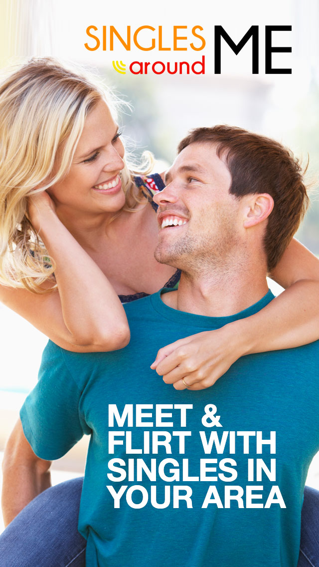
5. I choose option 1 because it is nice, simple and clean. The other one is hard to read and is really cluttered together.
8. First option was appeling to me it was very impressive.
11. so romantic
16. Interesting
22. Good look
23. COUPLES BE HAPPY
24. its romantic
26. like it picture
27. nice and cute
28. FEEL GOOD
29. simple
30. I like this thing a lot than all other things
33. It is lover picture
34. nice
36. The picture was more atttractive.
38. Nice
39. Interesting
41. Nice
42. Interesting
43. Based upon analysis i chosen option 1
45. 1
46. This app profile picture was very lovable.
48. Keep it short. Your first message should make a simple introduction, express your interest in her profile, ask one or two long-game questions about things you share in common, and then simply sign-off with your name. A couple lines, or a paragraph or two is great. When guys write a lot more, they come on too strong.
50. it can be meet and flirt with singles in your area.
26 Responses to Option B
26 people chose B as their choice
1. Option 2 is more appealing than option one. Moreover, it includes the inviting details such as; sign in...
2. my opinion
3. The photo is more romantic and it has location privacy options right on the screen which makes me trust it more.
4. It's striking and romantic, it looks like a movie poster. The other one looks fake and corporate.
6. Its easy to way of date.
7. nothing to say
9. option 2 was very attracting
10. I think that option two seems more legitimate to a meeting with a person, a more loving way
12. BECAUSE IT ATTRACT MORE
13. NICE
14. This has the option to sign in and actually view singles in the area. It looks more like an app screenshot.
15. BECAUSE COUPLES ARE KISSING THAT ADD
17. its more romantic
18. BECAUSE ITS ATTRACTS MORE.
19. It seems less cheesy and more realistic. I like the city environment a lot, especially since I'd definitely prefer a partner who also likes to explore and travel. The description on option 1 reminds me of NSFW/porn sidebar ads on streaming websites, too.
20. THE OPTION SECONF CHOOSE THE REALTIONHSIP BETWEEN THE HUSBAND AND WIFE
21. the option 2 look better then option 1
25. PROFILE IS VERY GOOD AND GOOD ATTRACTIVE OF THE PHOTO .
31. Option 2 is very attractive
32. because it has some security by having a location privacy and an option to sign in meaning one cant access the site unless they are a member thus making one to feel free and comfortable in it
35. I like to be single that's why i choose 2
37. I think it is more artistic, and looks less like an advertisement than Option 1 does.
40. option 2 is better than 1
44. interface is good, quick options are useful to the user
47. The Sign In option is right on the front page, the heart balloons match up with the hearts underneath the log in, and the picture is more relatable
49. I chose option B because it appealed to me more and seems more interesting
Demographics
Manage pending orders and track invoices.
Gender (Personal)
Age Range (Personal)
Share Your Results
Anyone with the following URL can see these poll results.